top of page
TEAM
Me
TIMELINE
September – October 2022
CONTEXT
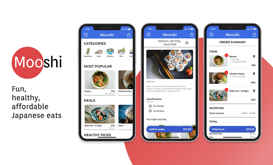
Mooshi is a mobile food delivery app concept that provides an easy way for people to order their favorite Mooshi dishes with transparency around nutrition.
The project was inspired by my experience as a server and bartender at a Japanese restaurant in Washington, DC.
Note: I'm working on significant improvements to this concept but I hope it shows my design process.

PROBLEM
Customers use the Mooshi website to browse dishes and make phone calls to place orders.
Since the launch of inzpire.me’s Talent Agency Solution, I noticed that talent agencies which typically manage larger creators were not onboarding all of their creators. This led to a poor user experience because agencies weren't getting the business they expected from the platform.
These creators are highly sought after by brands so why don’t talent agencies onboard them?
GOAL
Streamline the process to place orders and give customers transparency along the way.
SOLUTION
Nutrition and budget-focused mobile food ordering app.
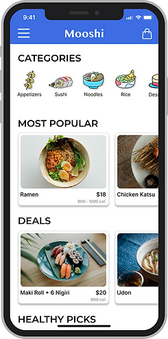
Discover
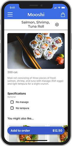
Customize
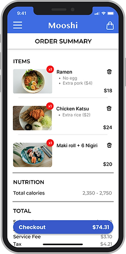
Review
Pay
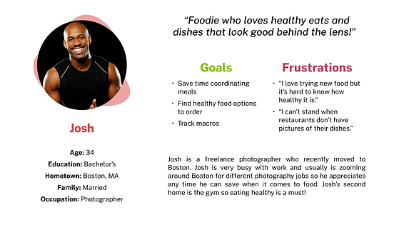
PERSONAS

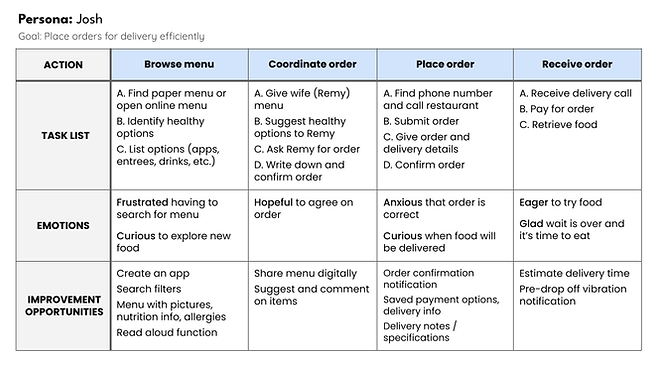
USER JOURNEY MAP
.png)
USER RESEARCH
I conducted user research which included interviews with four participants to learn about their experiences, goals, and frustrations using food ordering apps.
USER PAIN POINTS

Time

Nutrition

Payment
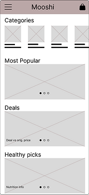
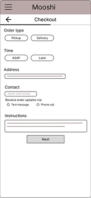
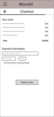
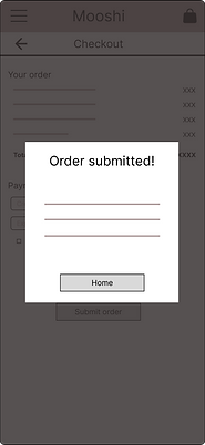
LO-FI WIREFRAMES
From user research, I learned that our users are busy and care about saving time, which is their primary motivation for using the Mooshi app. Many users are also health-conscious and care about eating healthy.
I brainstormed paper wireframes and then moved on to creating lo-fi digital wireframes.
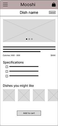
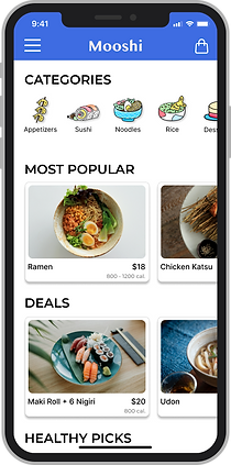
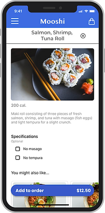
In the finalized wireframe I prioritized preset categories so that it’s easier for the user to discover healthy dishes or good deals. Users also like to see pictures of dishes, especially for Sarah who is dyslexic and struggles with text-heavy menus. For health-conscious users, I included calorie counts for each item.

USABILITY STUDY FINDINGS
4 participants
Round 1 – lo-fi prototype
Round 2 – hi-fi prototype
Round 1

Lists are helpful for discovery
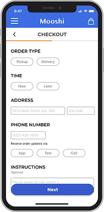
Additional payment options
Better organization of full menu
Round 2

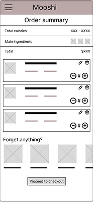
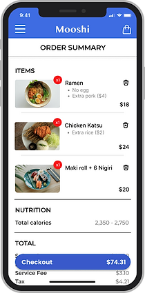
Order summary page is repetitive
Include estimated delivery time
ACCESSIBILITY CONSIDERATIONS
Hamburger menu – collapsible menu compatible with screen readers
Screen-wide CTA buttons for users with low dexterity
Icons to reduce text clutter and make navigation easier
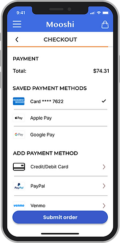
FINALIZED DESIGN


*My UI skills have improved significantly so revised designs will be posted soon.
bottom of page